
Åsa Wallander about the 2D art in Lorelei and the Laser Eyes
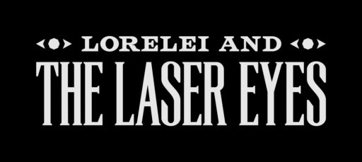
Simon gave me just one direction for the logotype for Lorelei and the Laser Eyes. He wanted it to be wide, as the Sayonara Wild Hearts logo with its square proportions was difficult to place in a lot of contexts. I used title screens from old black and white films as my biggest source of inspiration, as the game is quite cinematic in style. I also looked at typefaces from different eras, mimicking the ambivalent sense of time in the game. For a long time, the logo felt quite naked, so I decided to add the two eyes on both sides.



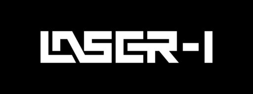
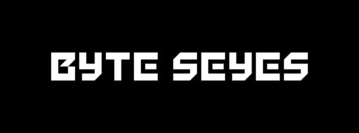
I also created several other logos for fictional elements in the game. Sometimes it would be a logo for a newspaper, a nursing home, a car brand or a police badge. There are two game devices in the game, both created by the made-up company KLB Electronics. All three logotypes were done fairly quickly, using a grid for proportions. The LASER-I logo was originally created for an arcade machine in the basement, which was scrapped in favor of a game console.



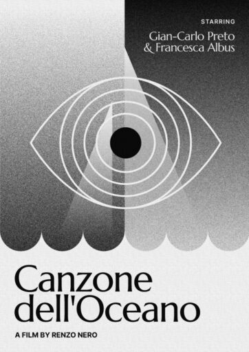
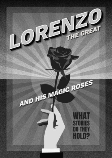
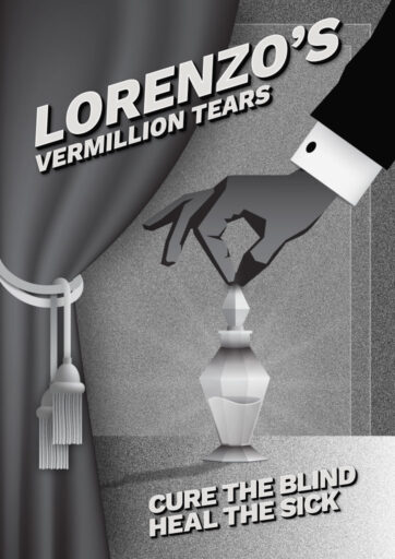
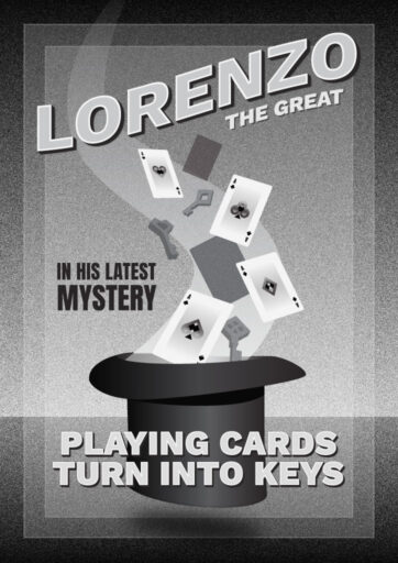
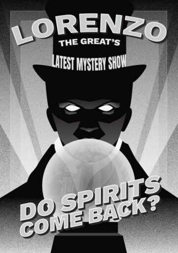
As the game is so unclear about when or where its story takes place, I did not stick to one particular style or design for the art and designs I provided. Instead, I loosely grouped them, so the movie posters had one style, the magic posters another, and so on. For the fictional movie posters, I was given the films’ plot as the only direction.
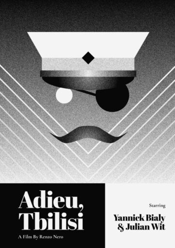
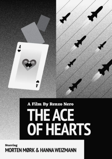
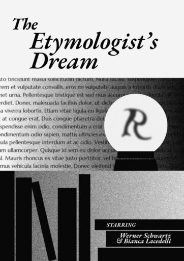
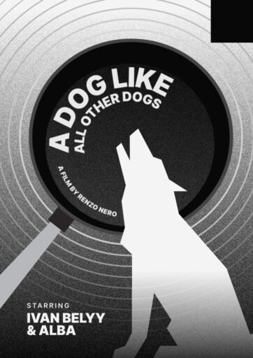
I was also tasked with creating the in-game maps, from Simon’s rough sketches. The game’s original design had a functional house, but shifted during development to one that made less sense and was designed iteratively with rooms sometimes slightly overlapping or having much larger distance between eachother than possible in reality. We had to retrofit the maps to an unrealistic space, and sometimes even change rooms to fit the map.
There were a lot of different types of graphics to create, often requested when new puzzles were added to the game. The 2D art and the different logotypes found in the game are not there to impress individually, or even to be noticeable. They are created to work with the story and make the game’s world feel realistic.
The game feels like a quilt to me, with different graphics sewn together to work as one whole. It was both liberating and difficult at the same time. One one hand, I worried that it wouldn’t come together in the end, but on the other hand I felt very free to explore different styles and directions.

