Now that a few weeks have passed since the release of the game, and a lot of you have had the chance to play it through, we think it’s time to show you some early concepts and tests. Hopefully we can do more than one blog post about this, but for this first one we’ll focus on art. Some of these pics will be really rough.
At first, the game was going to have a somewhat different story, and as such the art was also different. Here are some early tests, with a much more “visual” direction. We were planning to have graphical elements mixed with the text, before coming up with the black and white “windows” into Anna’s world. And we had not figured out the “text-map” concept yet. The game was going to play a lot more like Year Walk.

This might very well be the first visual concept. We were using our own Year Walk font before having decided which font(s) we should license.

Words forming shades.

In this scene, the words were supposed to “fly” towards the player, forming a three dimensional staircase


I wasn’t satisfied with any of these, and quite frankly I dislike some of them.
This pic was something of a turning point for the project:

When we looked at this we started to talk about how cool it would be if that picture of the lighthouse was actually a little window you were looking through, with parallaxing objects.
Becoming somewhat obsessed with this thought, I went into to the office on a weekend to make a fast test of that, and this is what came out of it:
As you can see, we had decided on some sort of island setting this early!
I used a photograph I found on the net to keep things simple, but we thought using a photo like this looked rather amazing, actually. It was such a neat effect. After this test, we started to talk about these “photo windows” would actually be little video transmissions, and that really got the ball rolling with the story. We ditched the story we were planning (involving something about brain damage from experiments attempting to create “Super-Citizens”…)
I still felt like we were struggling with the art, but at least we had something a little more substantial now. I decided that we should change direction completely and go for something a lot more minimalistic.
With that in mind I started to look for new inspirations among album and book covers. I also thought things like blieprints, flowcharts and floor plans would be good inspiration to create a look of a 60s computer gone mad.
Here’s a collage of inspiration pictures for the art:

Designers and artists here include Sam Suliman, Neil Fujita and more.
Some of these things ended up being even more influential than we could’ve imagined. I think it’s safe to assume the Honky Tonk album cover inspired HAT’s logo. And there are things in the game that are obvious homages to some of the images in the picture above, as well. Can you spot them?
I started to think of the game’s art more as a collage, not in a literal sense, but I wanted the inspirations to shine through and be very obvious. This would run through the project as whole: you could say it ended up being a collage of different medias (books, games and even TV), things and places we stumbled upon (things at flea markets, a storage filled with Soviet film equipment … maybe a famous TV tower?) and friends helping out with voice acting, proof-reading, as models for photographs and even including one of them as a character in the game.
Early on we came to the realisation that it wouldn’t be possible to interact with puzzles directly in our “windows” due to them being too small, so we came up with the idea of using buttons (this would later tie in with the narrative as well). So that coupled with the new sources of inspiration, led to this:

By now we had already licensed the font used in the game

Ellipses became something of a theme of the art, and I thought growing circles almost looked like some sort of signals, which fitted the story perfectly.
With the story in place, and the art heading in the right direction we started to make the first chapter of the game as a prototype of how the rest of the game would work.

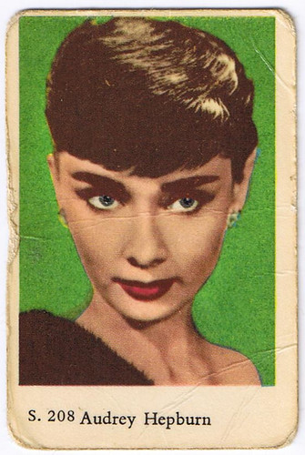
I still wasn’t 100% satisfied with the looks of the photographs inside the “visions”, as we had started to call them by now. I was going for some sort of retro look, either by color grading them very heavily or coloring them like those old cards of movie stars (do they have a name in English? We call them “Filmisar” in Swedish!).

Bear vision test
I had trouble to keep a consistent look. Every “vision” looked different from the next. I started to think about the video transmission things we had talked about, and realised that by using black & white photographs that creepy surveillance feeling would be conveyed better, and I would all look more coherent. And as a bonus, I’d be able to make them even faster!
So that’s how we ended up with this, the final look:

The visions photographs are often a mix of our own photos and pictures from licensed texture libraries (again: collages!). Me, Gordon and Jonas would photograph every little odd device, or a freaky toy that we’d come across (and surprisingly many are based on photographs I already had. I’m not quite sure why I keep photos of mannequin arms or creepy dolls…)
With the work done on the actual chapters, we still needed to work out how the stuff in-between the chapters would look. Things like the little introduction picture before every chapter, the tests and questionnaires.
Here’s a quick video test I made for some of those things:

This “chapter complete” concept is odd, and way over the top:

I made these black to contrast with the “reading-part” of the game. But they honestly felt a little boring. We thought it would probably be a better idea to take the opportunity to make something really colorful, to really contrast the chapters. We also decided to license another font, to really differentiate it. And so we ended with the final look:

… Aaaaaand I think that about covers it all for now. We’re hoping to do more of these blog posts. Perhaps on music, the logo and puzzles? Let us know what you want to see, and we’ll see what we can dig out!