We’ve done some digging in the archives and found some stuff you might find interesting: Concepts, screenshots and other bits and pieces from the early days of Bumpy Road. We’re not going to go in to detail here how the game was made or anything, just some commentaries to the pics. Click any picture to see a bigger version. Enjoy!
First screenshot ever:
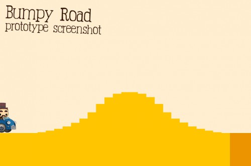
This is from the prototype made around christmas 2010 – You could create bumps and move the characters around and make them bounce. This was created in about two days. Notice how the characters are almost off-screen? That’s because at the early stages, the characters would wrap around the picture, like in old games as Ice Climbers or Ballon Fight. This idea was scrapped relatively early. The darker orange part to the right marks a gap in the road – Driving across that would cause the car to start blinking frenetically.
Very early character stuff
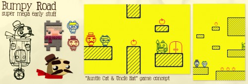
The characters in Bumpy Road actually started their life in other (abondoned) projects. They look very much like their final shape in a project called “Auntie Cat & Uncle Hat”, that we toyed around with at one stage.
Character texture and color evolvement

Was pretty fed up with the “fabric” look at this point, so the style was simplified more and more as we went along. Notice the slight proportions change in every evolution.
Background and evironment concept art
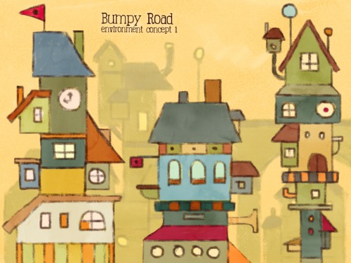
We struggled quite a bit with finding the right style for the background… And this was long after the characters and prototype were created. First we were going for some weird kid’s drawing crayon look and the houses were a lot more far out.
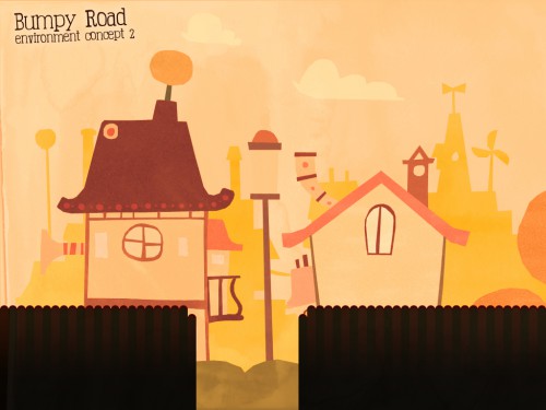
The architecture is getting a bit more “sane” here. And hey, check out the road. It’s all thin and there’s no blue water in the hole.
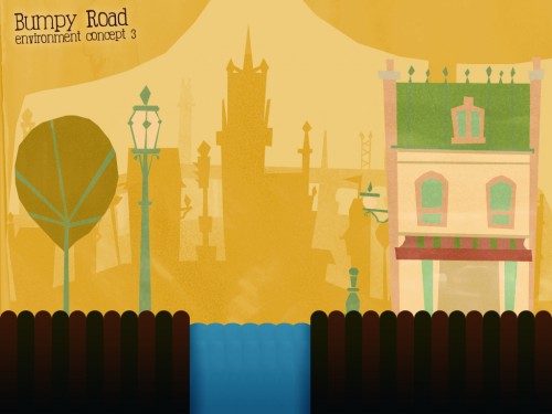
Here you can actually see where we were going. The houses look quite neutral, but a bit more cartoony. We were definately using 50’s and 60’s cartoons as inspirations here. Notice how the house to the right is the café from “L’Harmonica”.
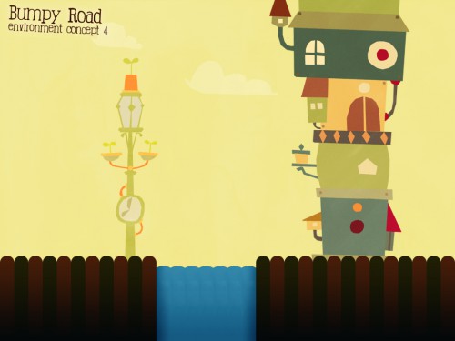
And a little side track back to weird land here, as the concept before felt a little to “normal”.
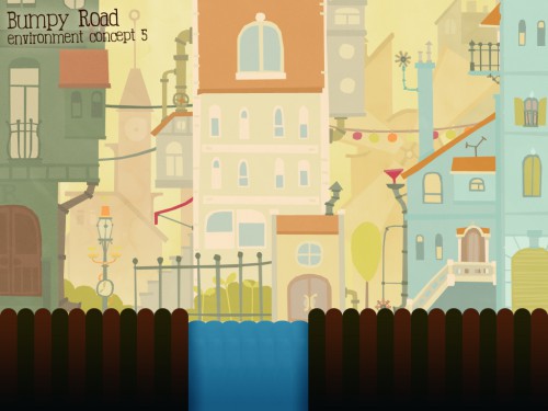
This is more or less the final background that is used in the game, but with a lot more dull colors. And the road is a lot more rounded.
Ground tiles
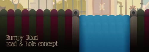
This is one of the earlier ground tests. We simplifed a lot of the art during the project, to keep things as clear as possible on small screens.
Early Gizmos

We decided to change these gizmos in to more coin like shapes as they were pretty hard to see, and felt to “hard”.
Font & Logo
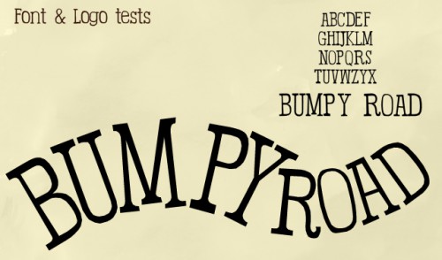
Bumpy Road uses a custom made font. Here it is when only capitals were created.
Memory Lane Concept
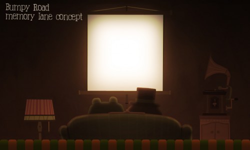
A lot more gradients and weird light stuff, and a lot less detailed.
Last, but not least!
Time lapse of how the background art was created. Click the pic to see it in motion!

It’s quite weird how these backgrounds were created without any real big picture, just adding more stuff as they were created. Also note how the houses to the right have a lot more detail than the ones to the left, which was created first.
That’s all!
